Building a Design System with Storybook and React
Whispir Marketplace
Once the designs were signed off for Marketplace, the next step was to combine the design language, with a React component library and style guide, to start building a design system.
Sector
Product
Services
- UX and UI Design
- Web development (React)
- Design System Development
Website
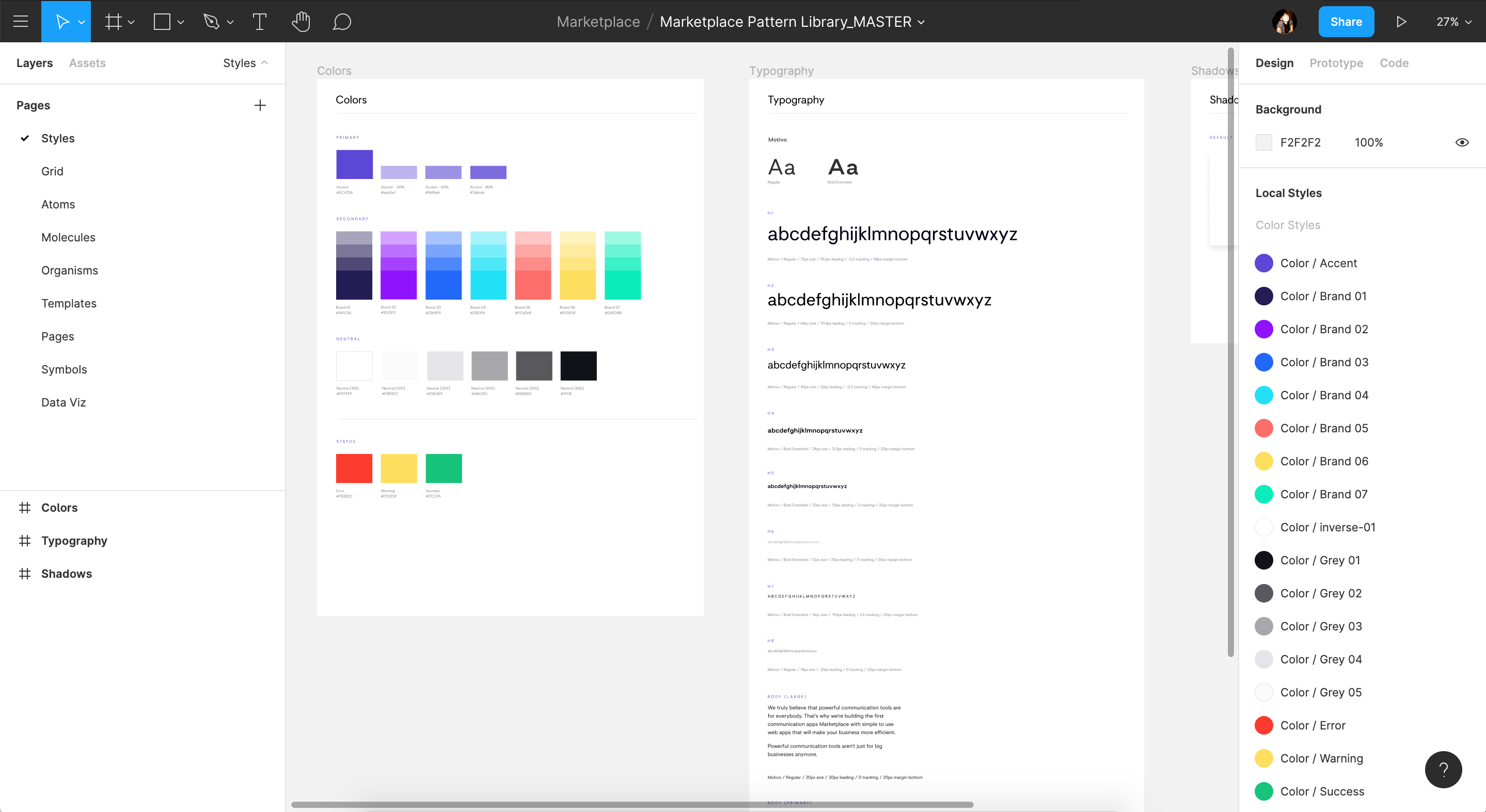
The pattern library in Figma, structured using the atomic method.
Prerequisites and Prioritisation
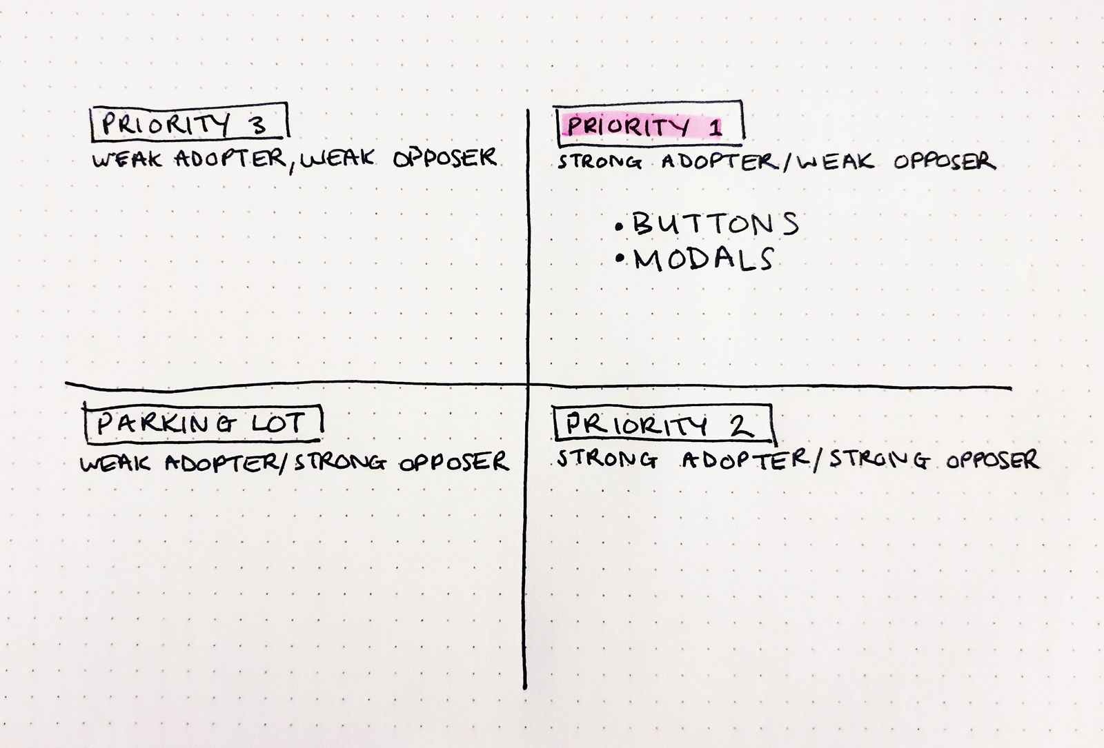
Prior to getting started, I wanted to ensure a few additional things had been considered and there were robust enough design foundations to start building the react component library.
I drafted and worked through a design checklist for aspects such as accessibility, interaction and screen resolution. Then I had to prioritise what to work on first—which components had the highest impact and were easily achievable. Using an adoption metrics method, it seemed as though buttons and modals had the highest priority in terms of impact, identity and confidence.
A common language between teams
It's is so important to have a common language shared between design and development teams when building out a design system.
In my Figma project, I already had all the folders structured following Brad Frost's atomic design methodology. This is the same system I wanted to follow when building out the component library in Storybook.
Developing Styled Components
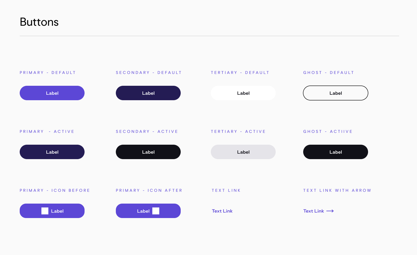
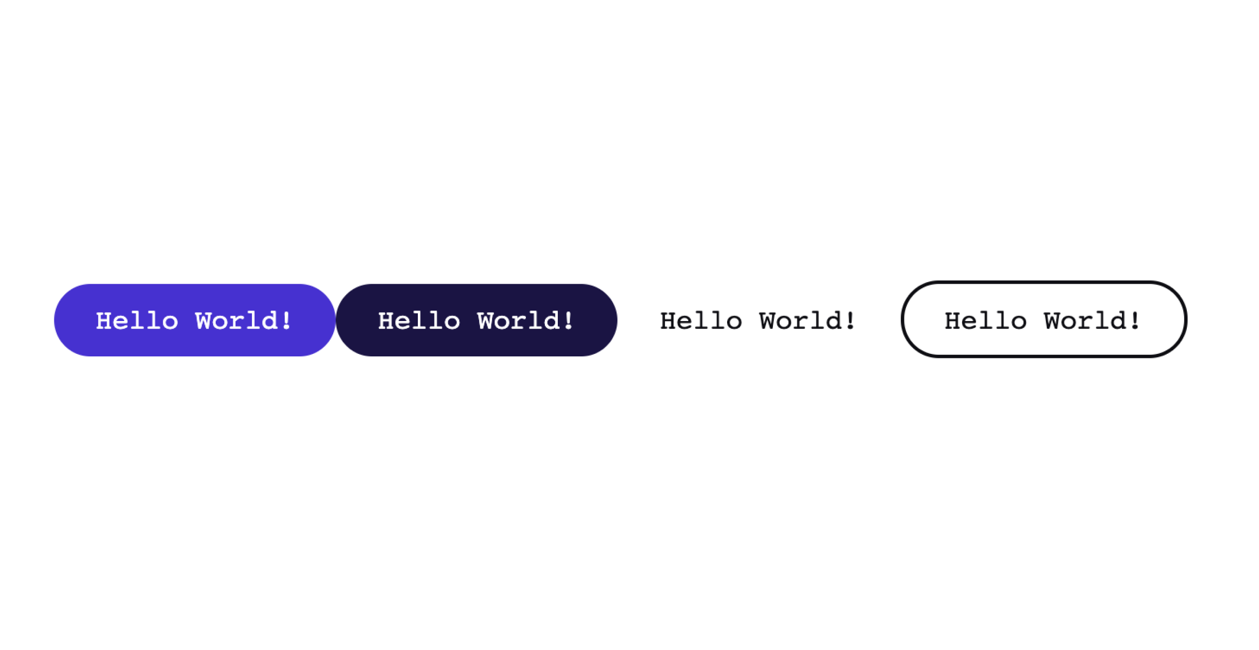
I decided to get started on my Storybook application by building out the buttons and modals as they ranked pretty high in adoption metrics and are used multiple times across the UI. I installed styled-components to get started on building out the Button atom.
There were several button types. Primary, secondary, tertiary and ghost button, plus icon buttons and a couple of link styles and each of these would need a variety of states, such as hover, focused and disabled.
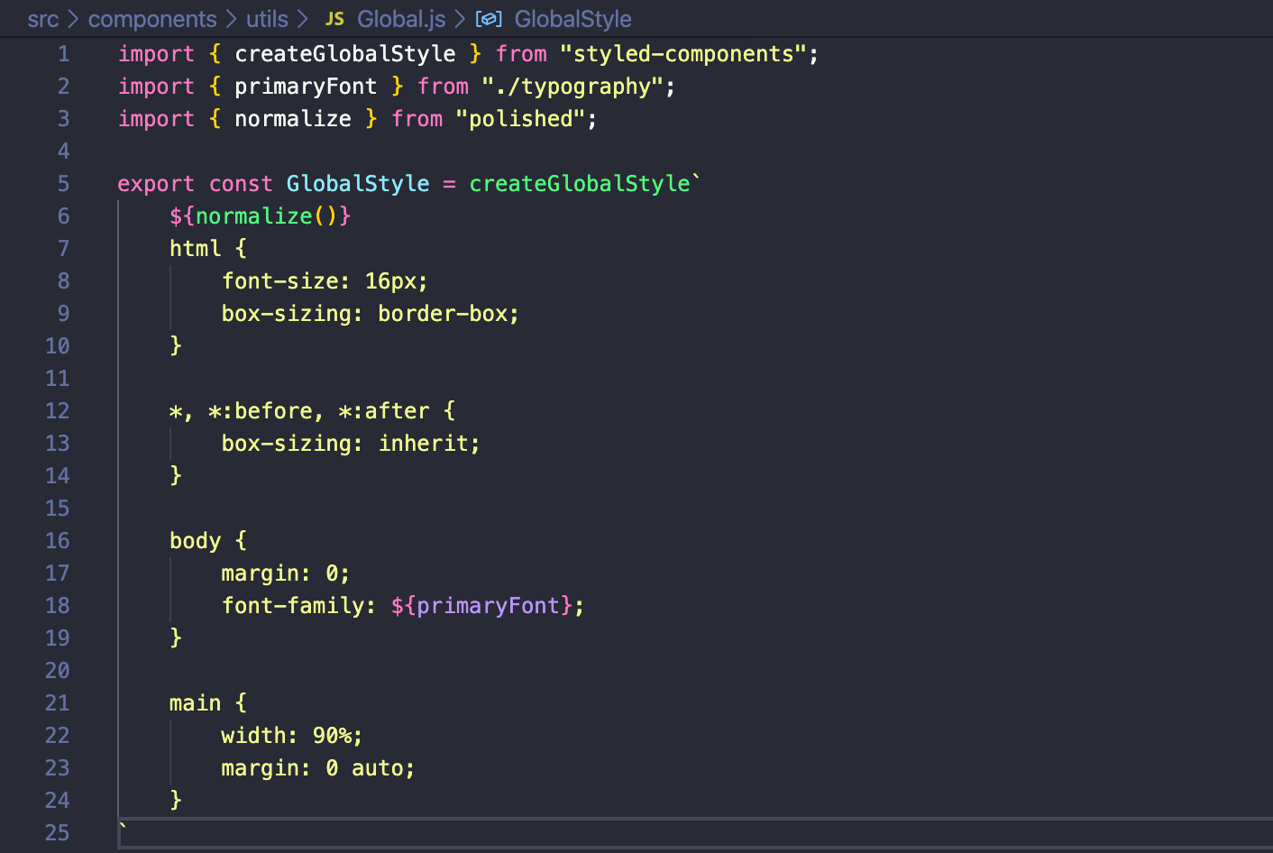
Global Styles
I wanted to start by 'normalizing' the UI. I decided to do this by using styled-components to set up a global stylesheet. To normalize the CSS I installed a package called polished which has lots of nice features such as 'hideVisually', as opposed to using display: none; in the CSS - a much better method to use for accessibility.
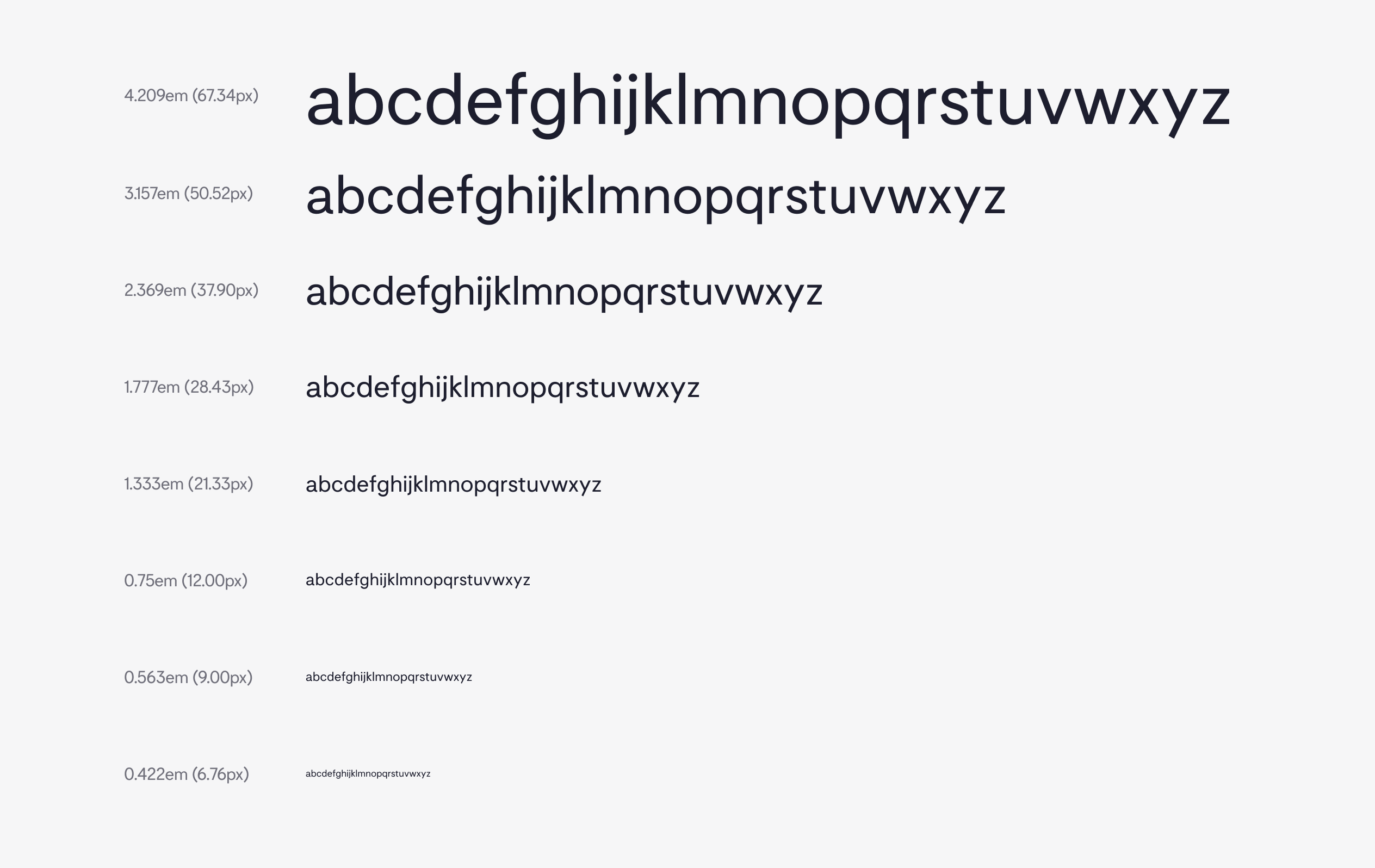
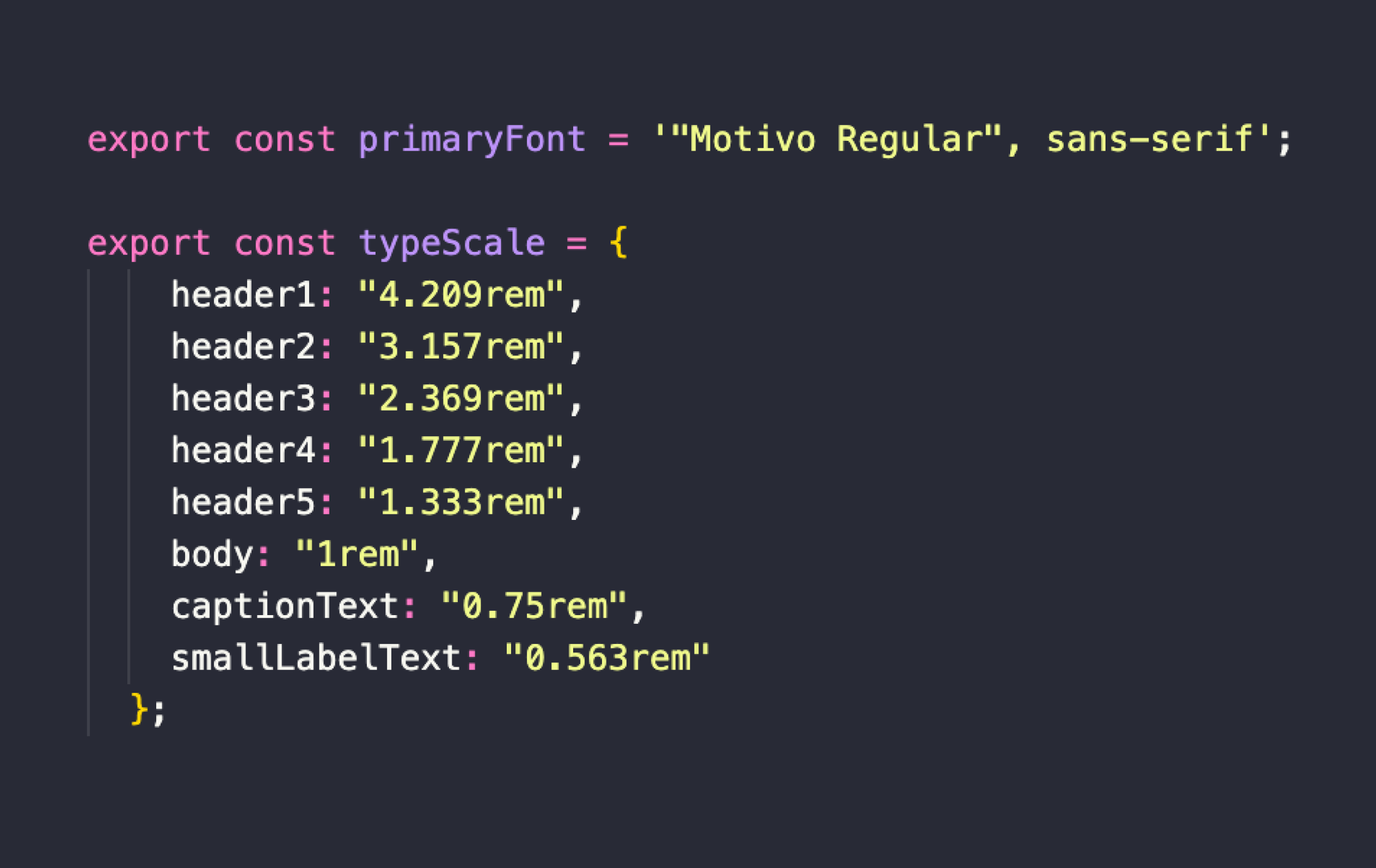
Next I set up a file for the typescale. As shown below I used a base size of 16px (1em) and a '1.333 - Perfect Fourth' Type Scale, from type-scale.com to create uniform type styles.
Creating Themes
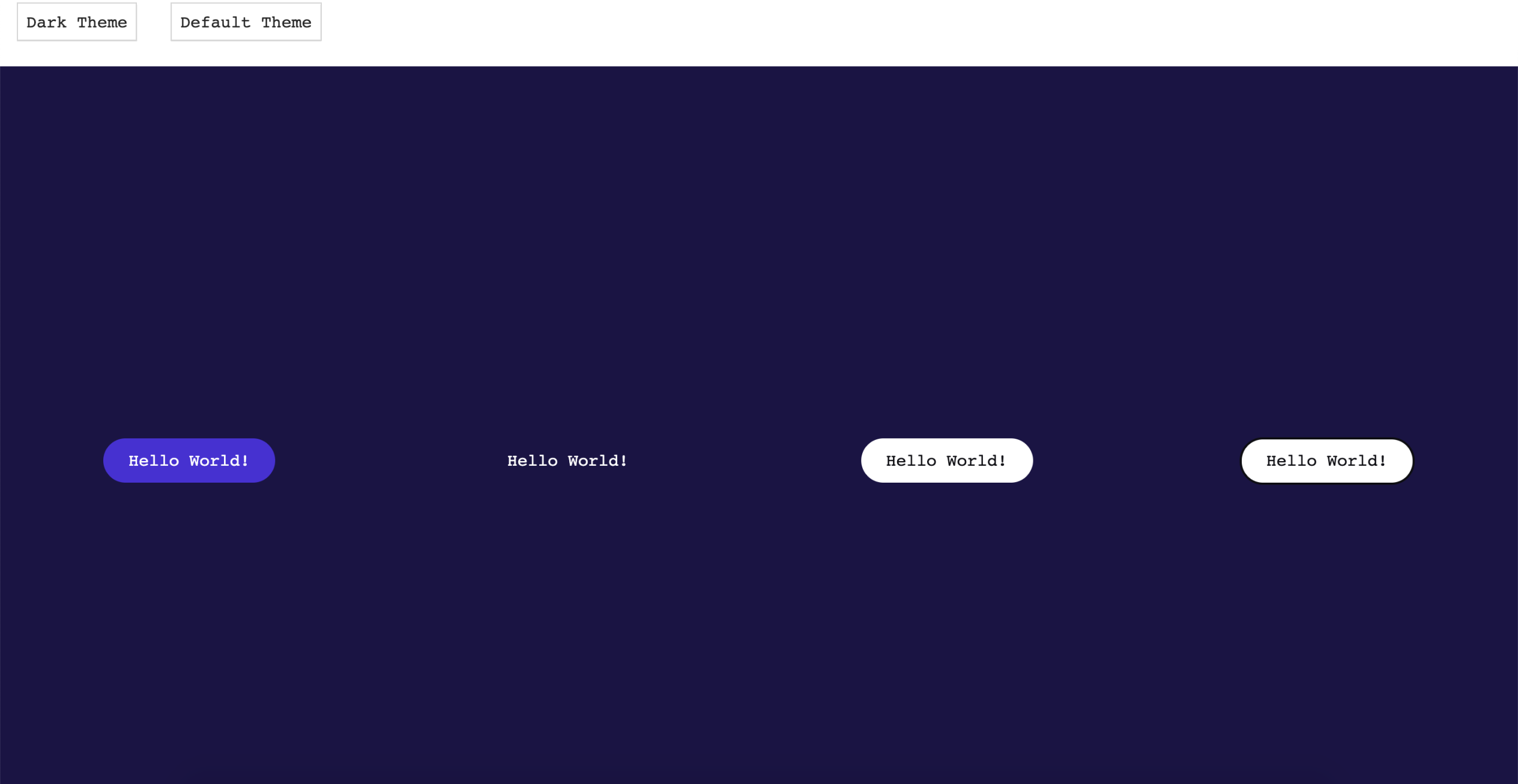
I wanted to create a dark and light theme as it is quite popular these days for the user to want to switch. Therefore I needed to create different states depending on the background colour and set this up with a toggle switch.
Creating a modal
The next component I decided to create was the modal. This was a molecule, to be built using the button atom and a combination of foundational elements such as an icon, an illustration and a couple of type styles.
Testing the Default and Dark themes on the modal to make sure that the button colour and background were updating properly when toggled.
Using the useTransition hook from the react-spring animation library, to experiment with transitions on the modal, depending on the users action.
I used the useSpring hook to fade the modal in and out as this is the most user friendly micro-interaction.
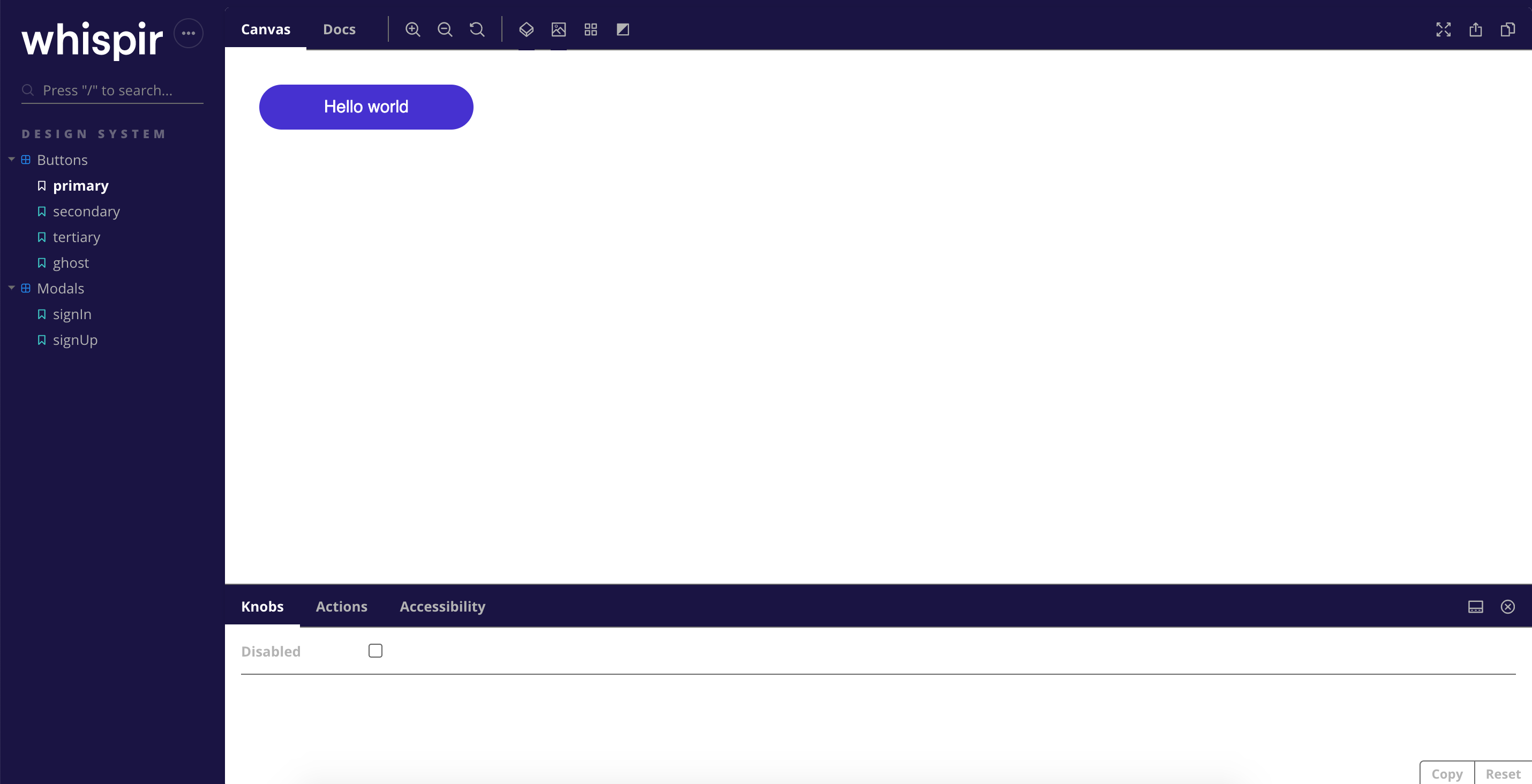
Getting Storybook set up
I installed Storybook to document my code and use it to write the style guide. I also needed to install a few addons to preview the different states, documentation, the themes and accessibility—Using the 'knobs' add-on to preview the disabled state for example, also 'storybook-addon-a11y' add-on to test the accessibility of my components.
Customising and deploying Storybook
I customised the site a bit, updated the logo and some of the colours etc so the shell looked a bit more on brand. I then pushed my code to a git repository and used netlify to host the site. You can check it out here.
