Visual identity development
Whispir
After establishing a new identity system for Whispir, the Marketing team reached out to Carlos at Journey Studio, to design a fresh new homepage and a set of character illustrations for us. I was responsible for rolling out this new visual identity across all of Whispir’s internal and external digital and print communications.
Sector
Product
Services
- Digital and Print Design
- Web Development
- Art Direction
- Project Management
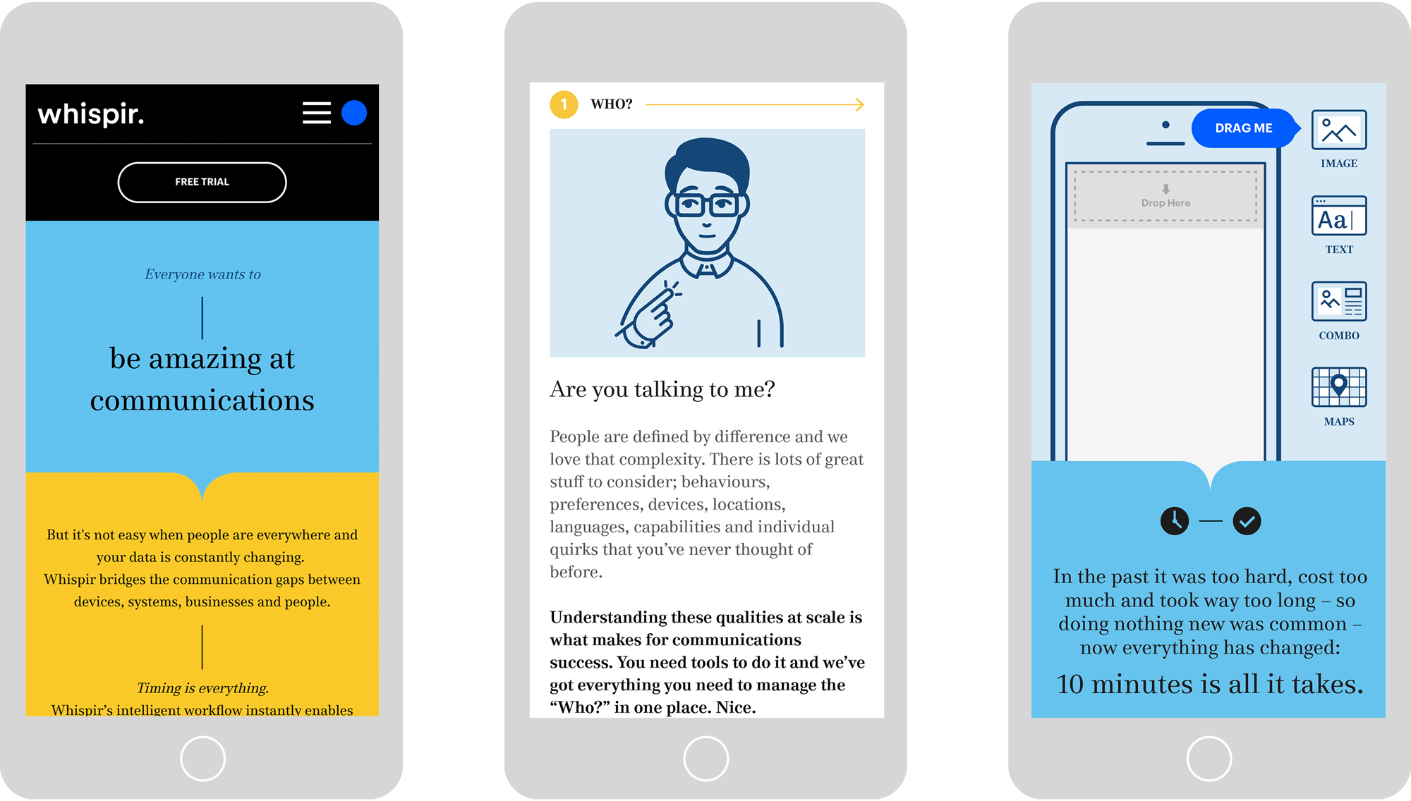
Evolving the visual identity
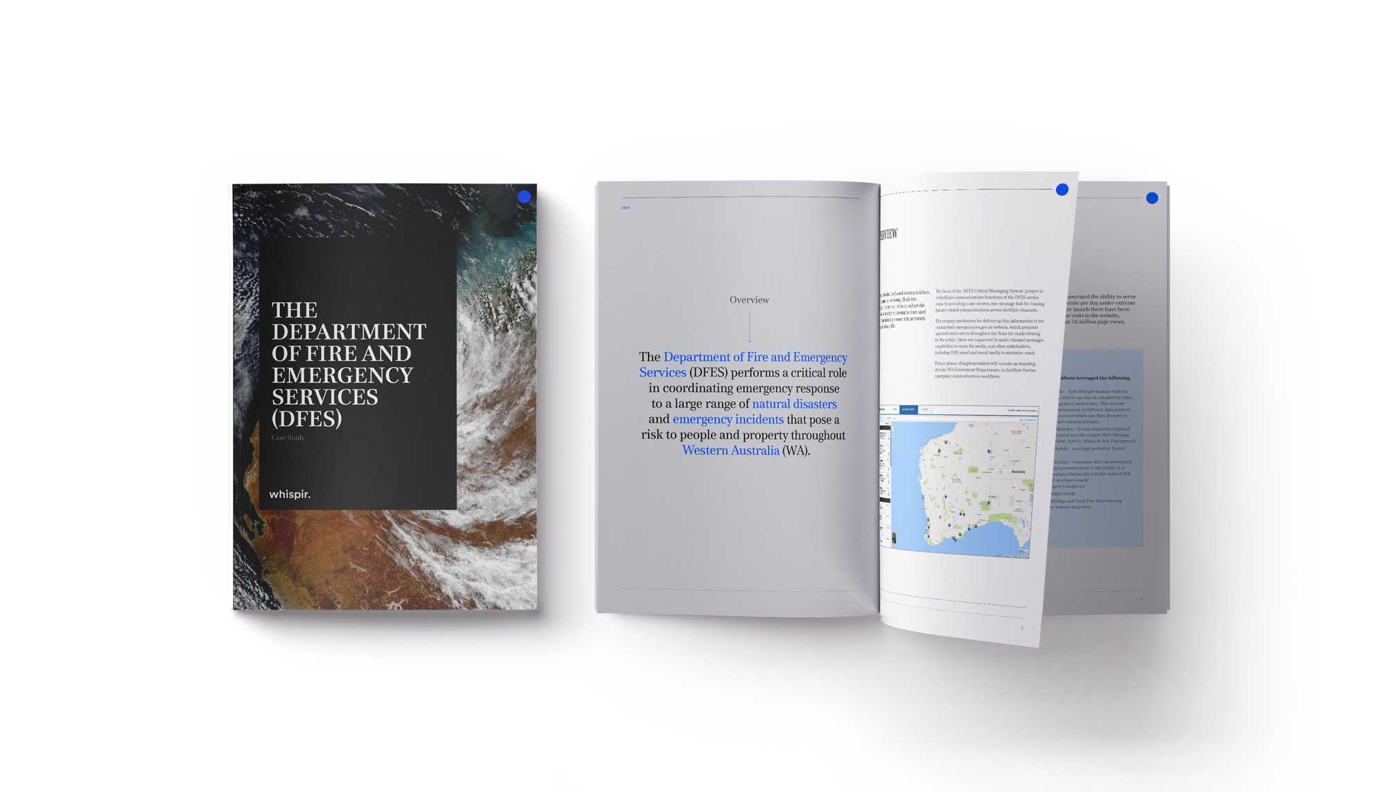
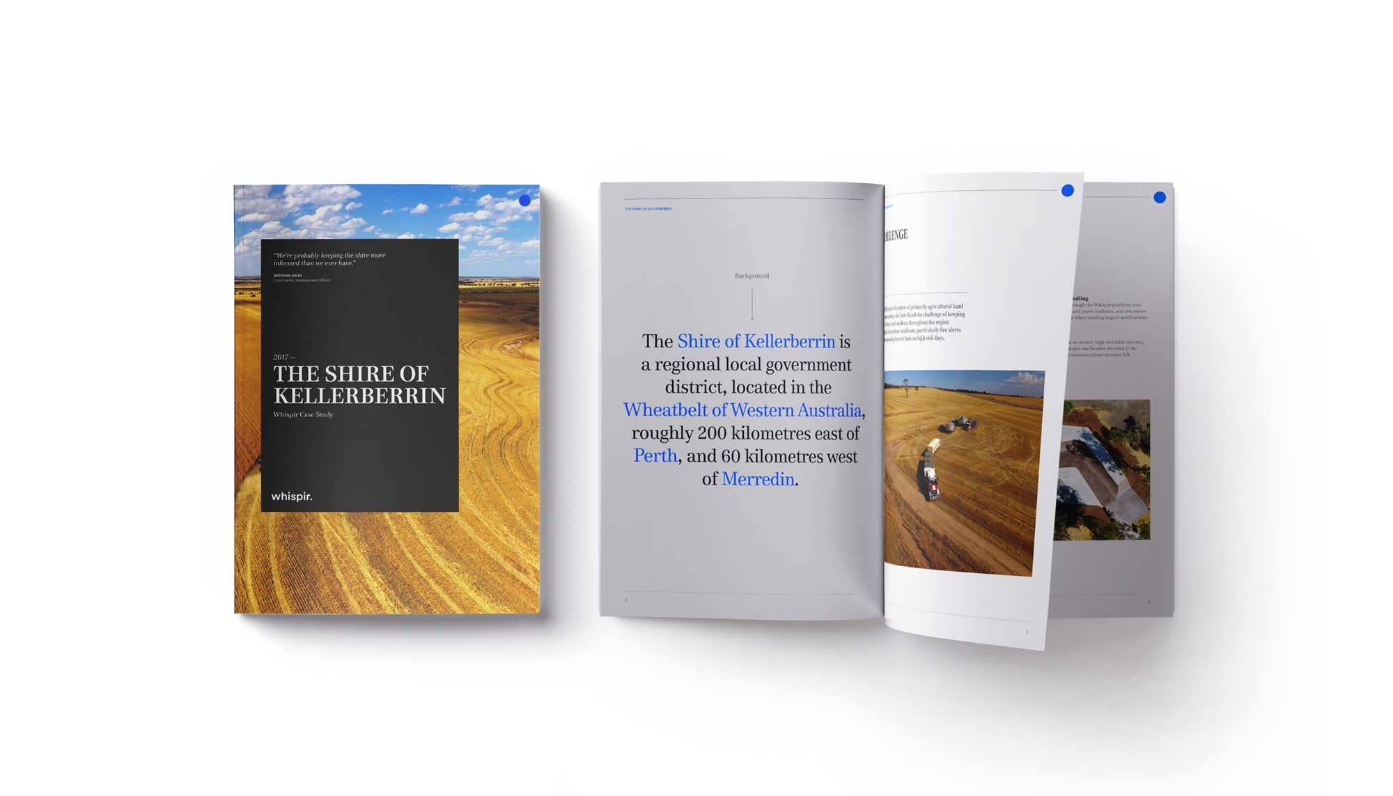
The brand evolution meant refreshing the designs for EDM’s, digital banners, social posts, infographics, rich media messages, presentation templates, annual reports, brochures and a new design for the blog.
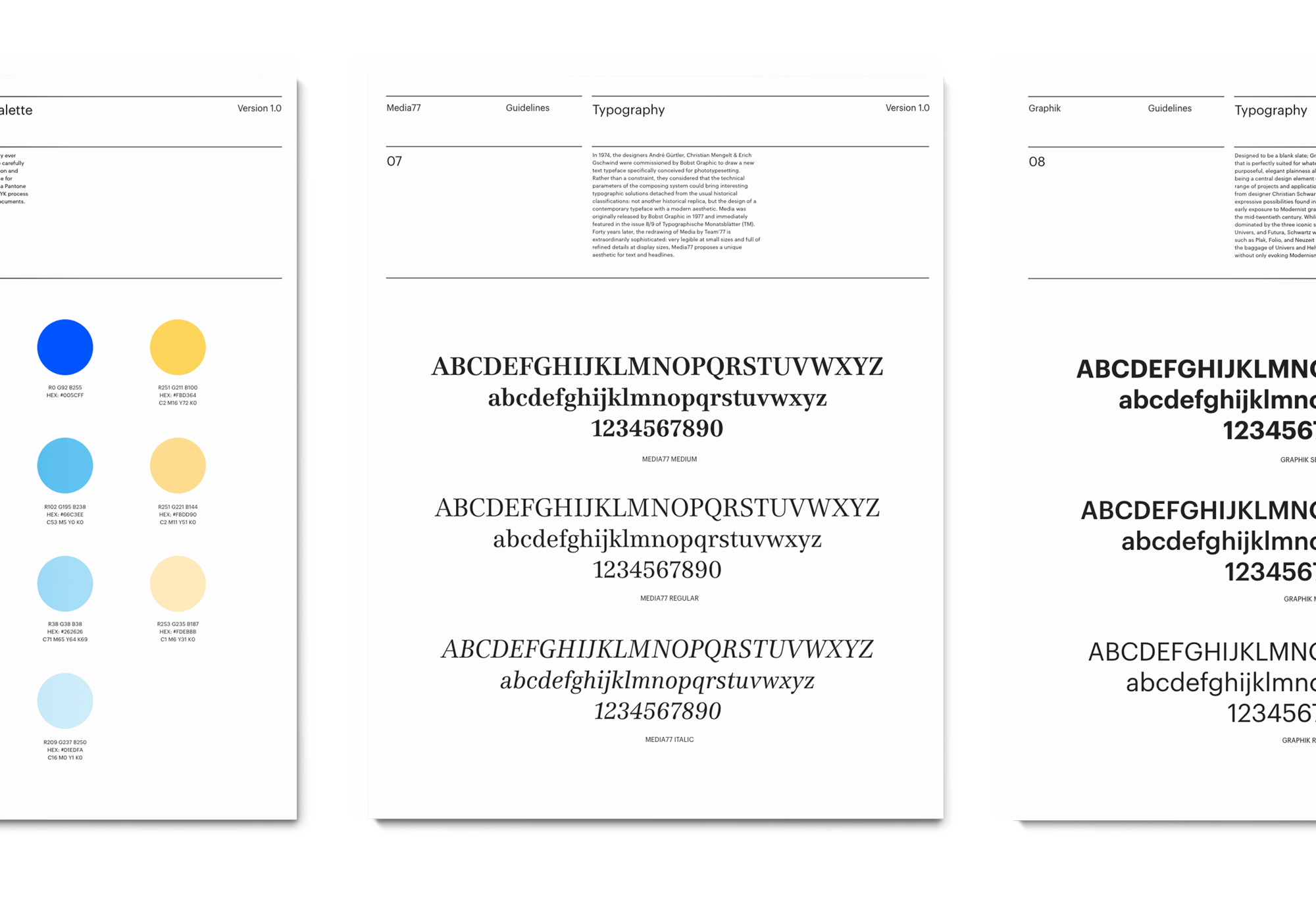
I started putting together a style guide for the foundational elements of the brand, such as the colour palette, typography and iconography.

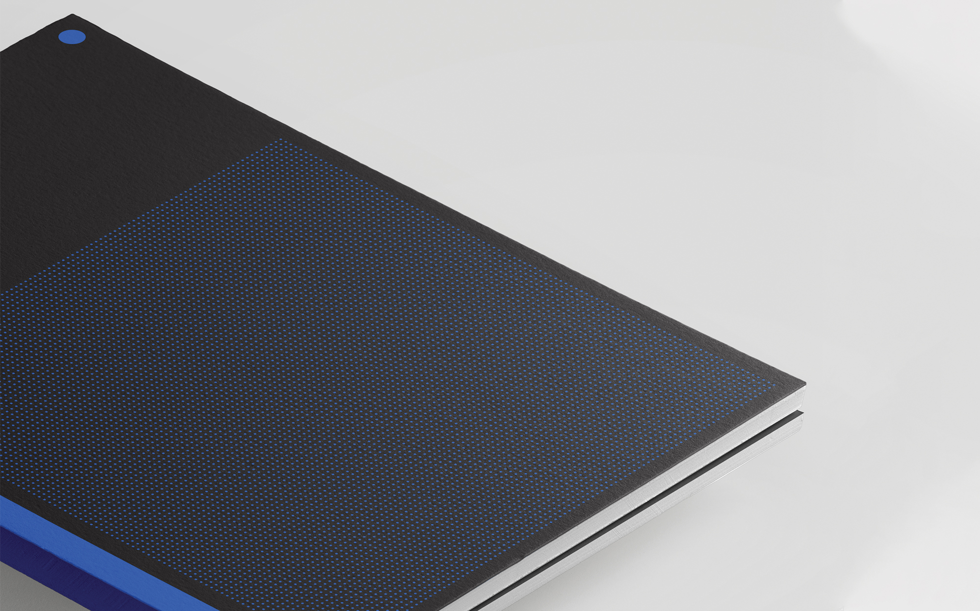
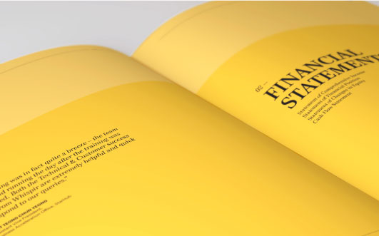

The Annual Report and Case Studies...
Redesigning the blog
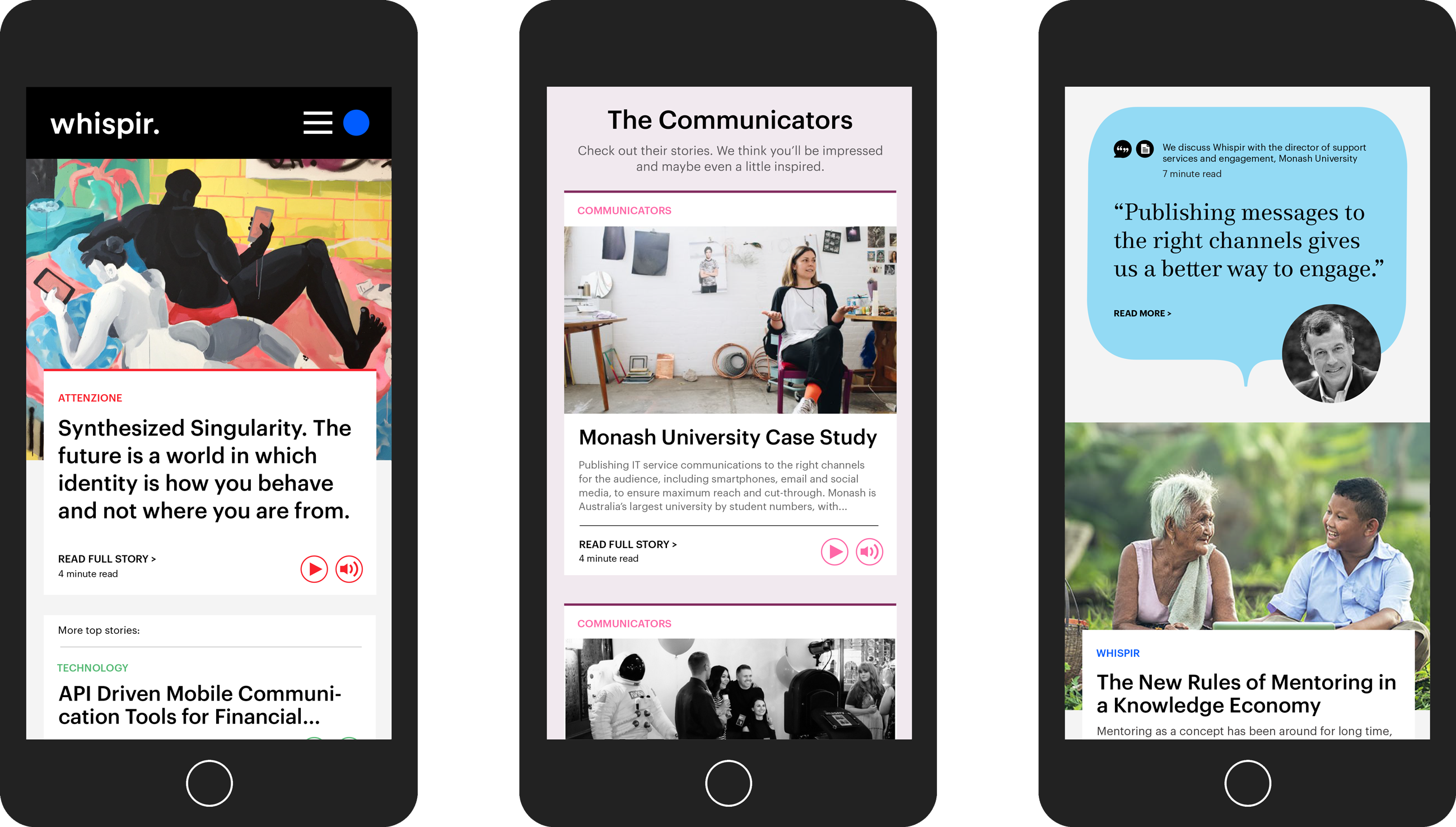
The blog consisted of a collection of customer stories and articles written by internal and external personnel. The redesign involved implementing a ‘content category’ tagging system and a secondary colour palette, along with a new look and feel.
The colour palette consists of bold, bright colours and a selection of complementary pastel hues. I used simple navigational elements and playful icons to represent each topic and sans serif, Graphik as the primary typeface, in contrast to our print collateral which uses a serif, Media77.

2019 Update
Due to changes within the business and the company going to IPO in 2019, Whispir underwent another visual identity refresh, check it out.